Packaging Redesign
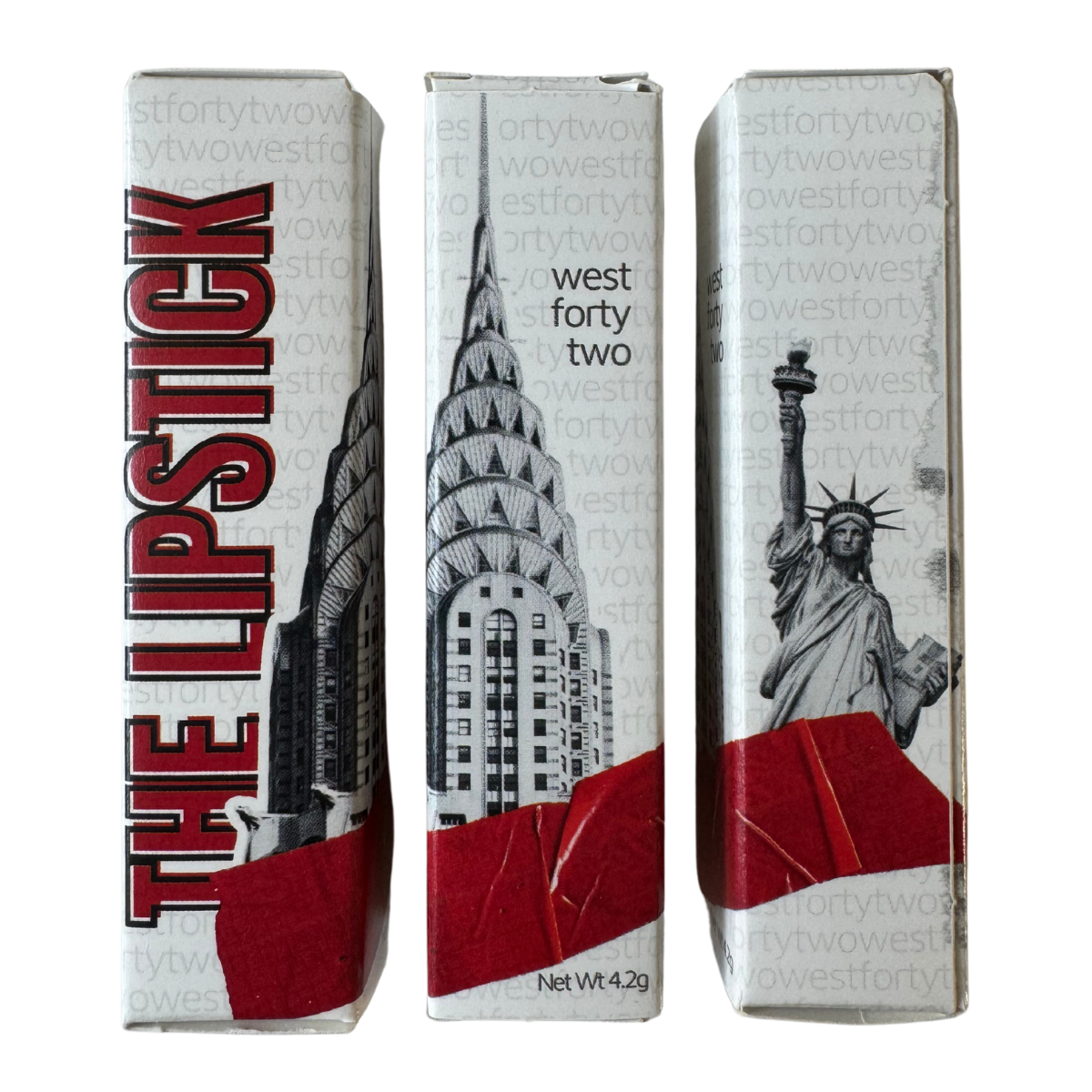
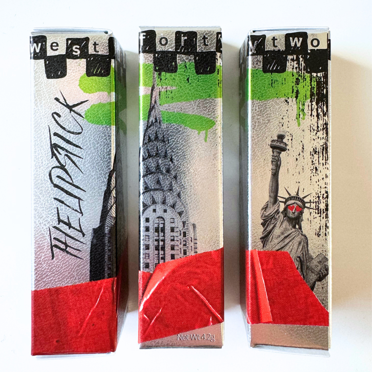
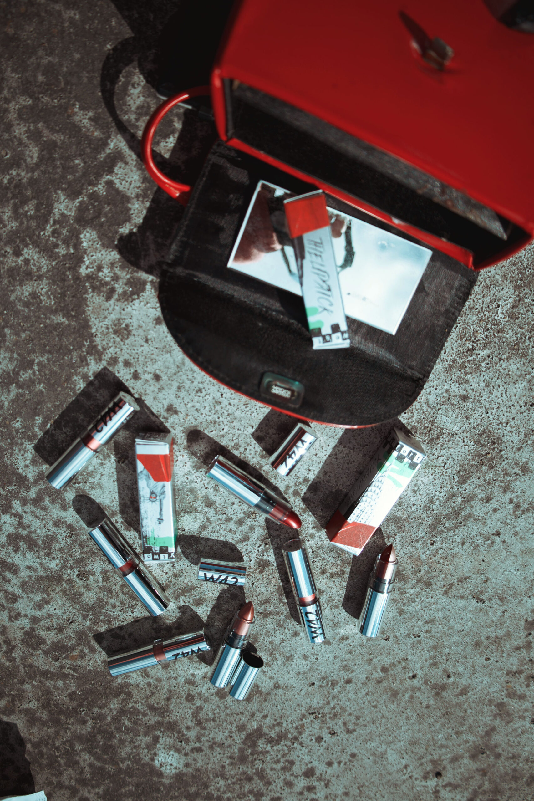
Carton revamp – drawing inspiration from NYC’s iconic skyline, we wanted to make W42’s carton stand out in the crowded beauty space.
The challenge: Take WestFortyTwo’s original packaging concept and create a more polished, elevated, and on-brand design for 2025.
Color Palette
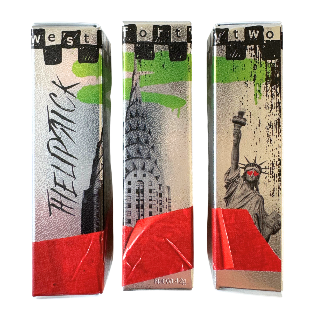
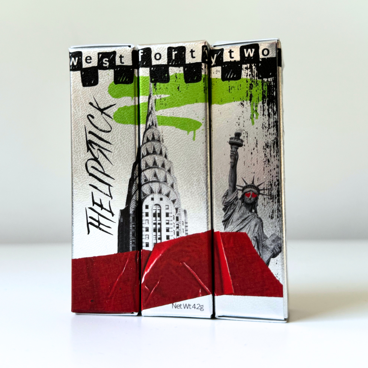
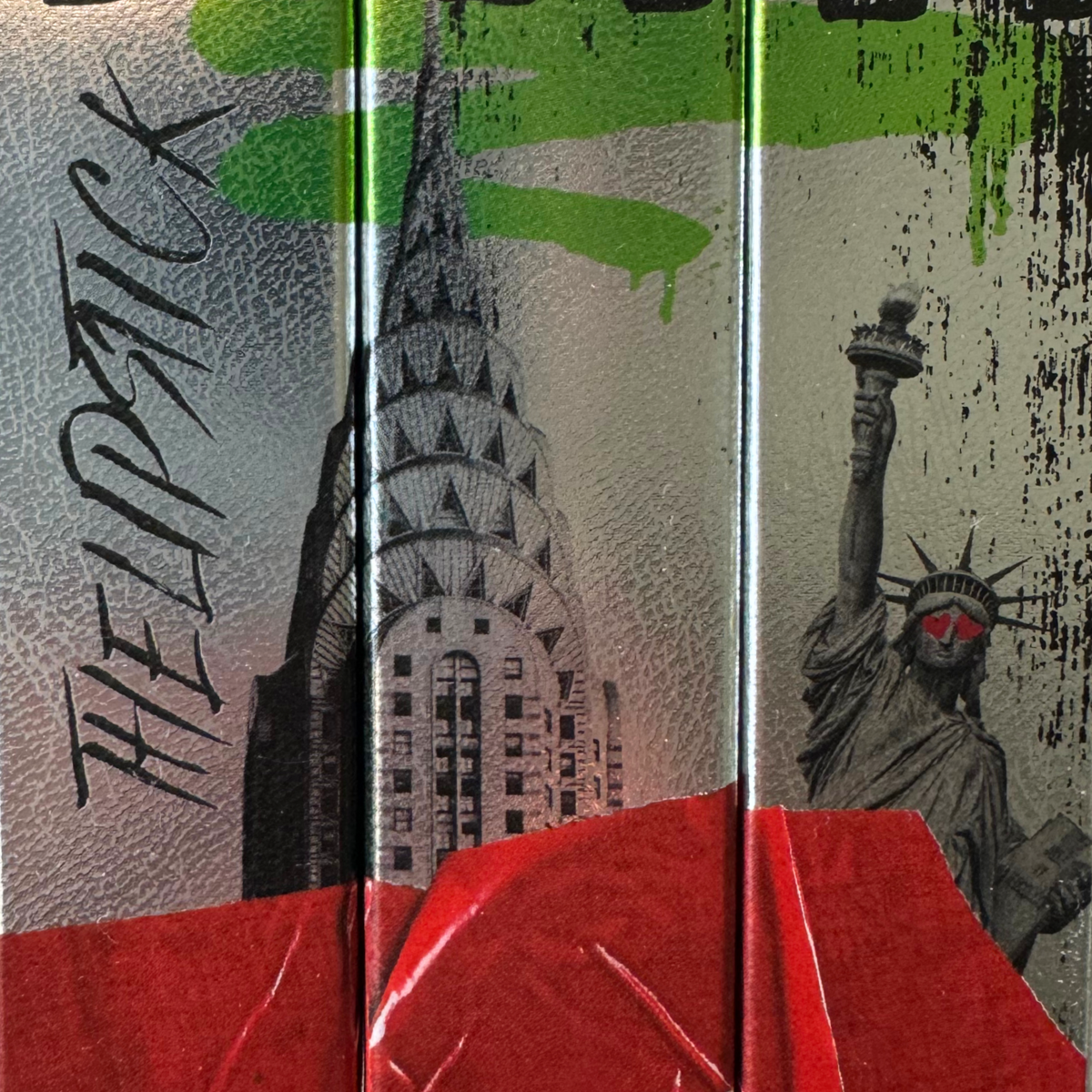
We chose a color palette of dark ebony, neutral grey, bold red, and vibrant green. The neutral grey was inspired by the concrete and steel structures of the city, while the dark ebony pays tribute to the shadows cast by the massive skyscrapers. The two together serve as shade and light. The bold red and vibrant green represent stoplights, neon signs, and most notably the red and green subway entrance globes that have a debated, but beloved history for New Yorkers.
Visual Elements
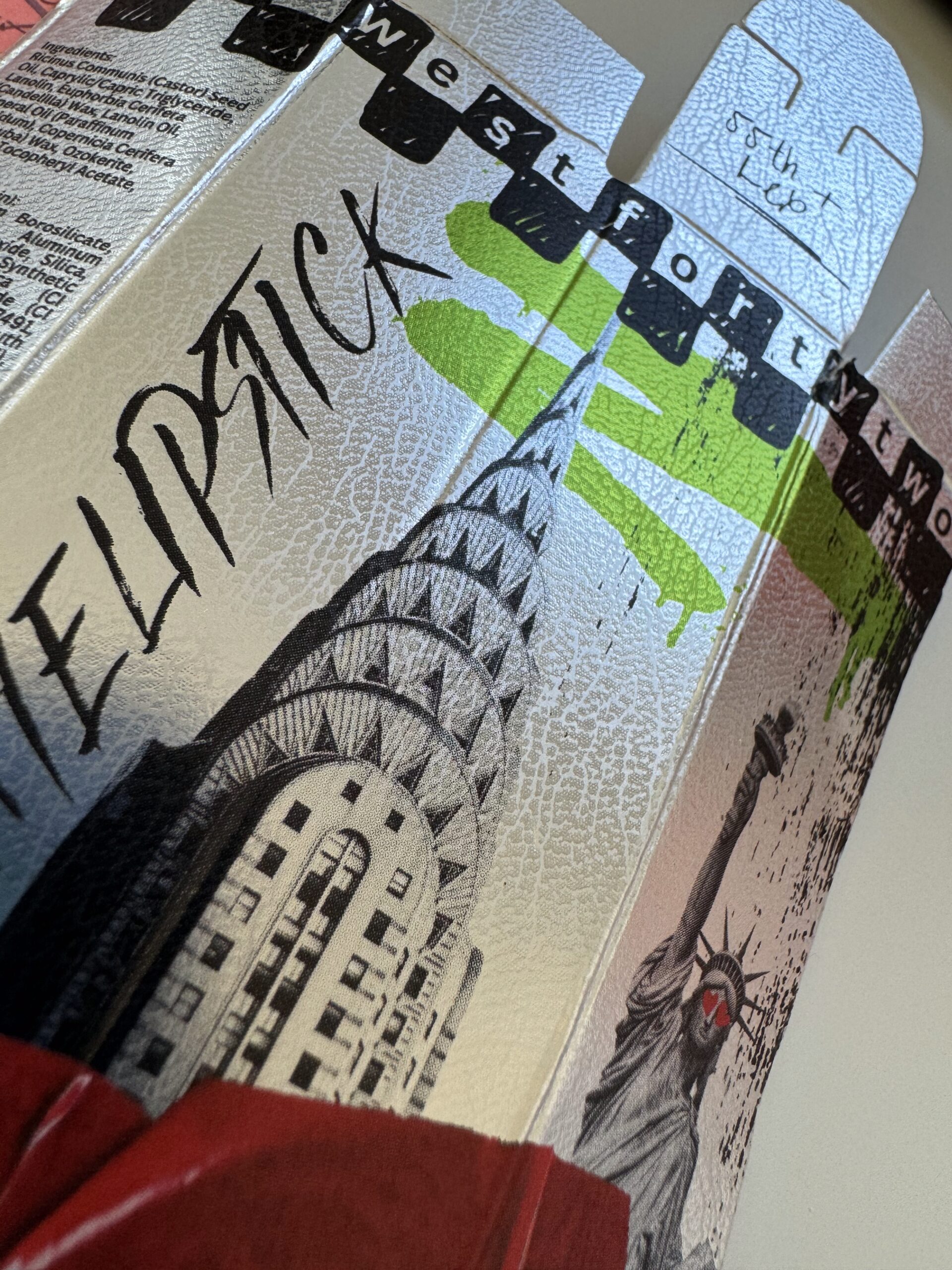
Manhattan skyscrapers are gorgeous, glimmering feats of human engineering. To pay homage to them, we began our redesign with a metallic background. While shiny new metal is alluring and sleek, it does not quite match the weathered texture of our beloved skyscrapers. To emulate the grit that is synonymous with NY, we chose to create an embossed leather texture on top of the metallic paper for our design. The unique tactile and visual quality is unlike any other packaging we’ve experienced in the beauty space.
We didn’t stop there. Adding spot-gloss to select mixed-media elements (like the red tape across the bottom) adds dimension and texture with a little bit of extra shine. We chose to retain some of the previous packaging’s iconic NYC landmarks. The Chrysler Building and the Statue of Liberty are irreplaceable, of course. We also felt that it was crucial to retain these elements to communicate the longevity of these monuments and the persistence of the NYC spirit. While much may change about New York, these landmarks and citizens alike will continue to stand tall.
To reinforce the imagery of resilience, grit, artistry, and freedom of expression, we’ve incorporated elements of graffiti, stickers, and mixed media throughout the design.
The packaging design now accurately reflects (no pun intended) the brand’s values and emphasizes the unique nature of the product.
Use the handle in the photo below to toggle between the old and new designs.